Designing clear user interfaces in high complexity
Practical ways to lower cognitive load, structure dense information layouts, and build clean typography systems.

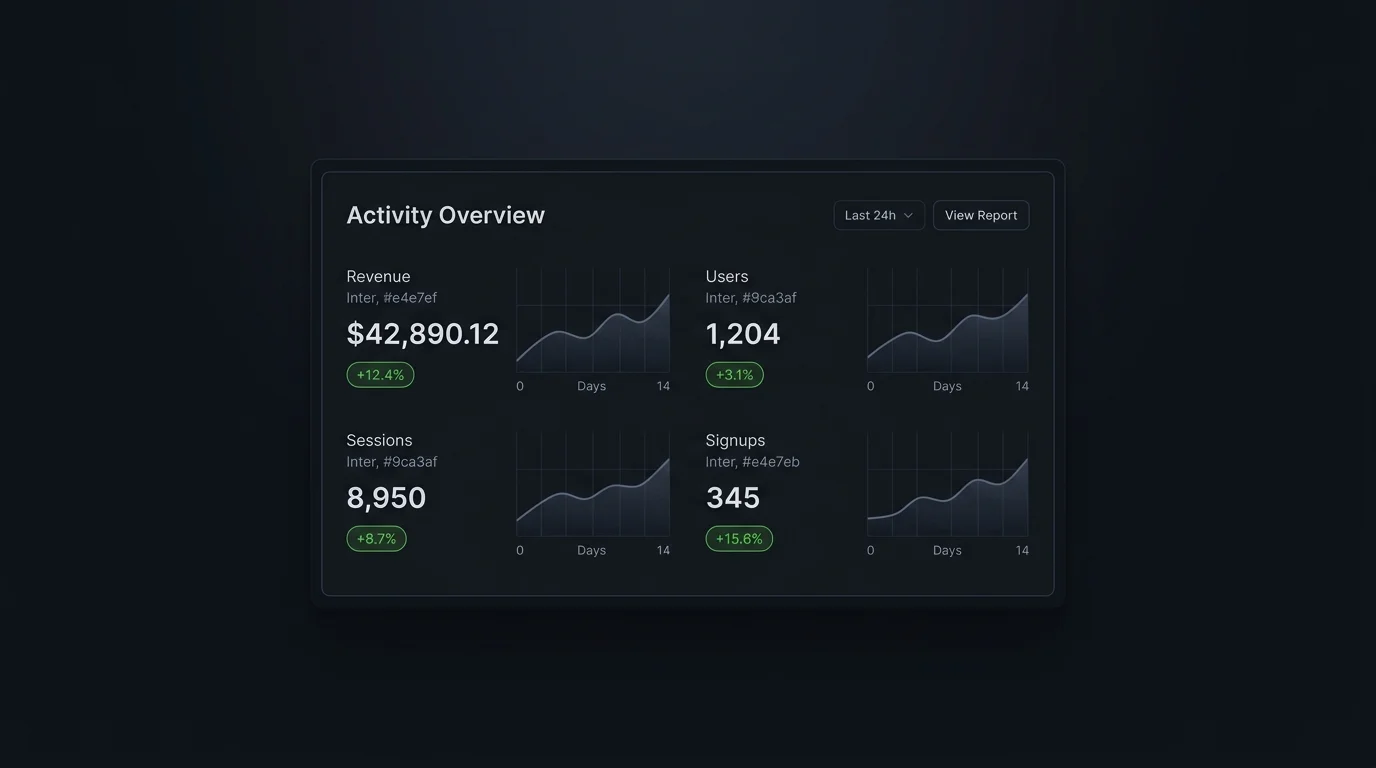
Designing interfaces for data-dense dashboards, SaaS portals, or complex custom applications presents a unique challenge: how do you display large amounts of information without overwhelming the user?
Here are key design methodologies we use at ConstMind to maintain visual clarity in complex environments.
1. Establish Hierarchical Typography
Use size, weight, and color contrast to create a clear reading path. Display headings should use distinct fonts (like Outfit) to feel premium, while body copy should use clean, readable fonts (like Inter) with generous line heights.
2. Implement Progressive Disclosure
Do not show all details at once. Show high-level metrics, and allow users to drill down to see details via drawers, modals, or accordions. This keeps the interface clean and lowers the cognitive load.
3. Maintain Consistent Spacing Systems
Use a strict spacing scale (e.g., margins in multiples of 8px) to keep alignments consistent. Consistent margins and paddings give elements breathing room, making even the densest data grids feel light and navigable.